Movement, a company specializing in audio/visual design and installation, approached me to create a comprehensive brand identity and online presence that reflects their innovative and technical expertise. They sought a logo and website that would not only showcase their services but also resonate with clients looking for sleek, high-quality audio/visual solutions.
Product Designer
OBJECTIVE
In this project, I focused on designing a logo that captures the essence of “Movement” — dynamic, modern, and forward-thinking. The website’s user interface and experience were crafted to ensure a seamless, informative journey, with a minimalist aesthetic that emphasizes Movement’s unique value and high-end services. Each element of the website, from the design layout to the content structure, was tailored to engage potential clients and reflect the high standards of quality and innovation that Movement brings to every project.

DISCOVERY
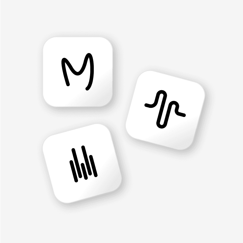
The logo was born from a deep exploration of what Movement stands for: a company rooted in audio and visual design. Through research and brand discovery, I identified sound waves as a core symbol of their work. This led to the concept of transforming audio waveforms into a clean, dynamic visual mark. The final logo reflects motion, energy, and clarity—capturing the essence of sound in a form that feels alive, balanced, and intentionally in motion.
DESIGN ITERATIONS
The early iterations explore different visual directions; aiming to capture the essence of movement through sound while subtly incorporating the letter 'M' to tie back to the brand name. The goal was to keep the mark simple, recognizable, and true to the brand’s audio-visual identity.

LOGO ITERATION
The logo was designed at a precise width of 48px with consistent 8px spacing between each element to create a sense of clarity, rhythm, and forward momentum. This intentional spacing not only reinforces the brand name Movement but also reflects the product’s core values of balance, flow, and progress through subtle visual cues.
DESIGN SYSTEM
At Movement, the design system enhances user experience with a sleek, modern aesthetic inspired by warming earth hues. The soft color palette creates a sense of leisure, while clear typography ensures easy readability. Consistent elements like buttons, icons, and spacing provide smooth navigation, and responsive design guarantees optimal performance on any device. This system reflects our brand identity and prioritizes usability, making it easy for customers to explore services with a friendly invitation to contact the company for more information.


KEY FEATURES
I incorporated movement at first glance of the website to convey the concept of adjustable audio sliders, similar to those found on an audio soundboard.
CONCLUSION
At Movement, the design system enhances user experience with a sleek, modern aesthetic inspired by warming earth hues. The soft color palette creates a sense of leisure, while clear typography ensures easy readability. Consistent elements like buttons, icons, and spacing provide smooth navigation, and responsive design guarantees optimal performance on any device. This system reflects our brand identity and prioritizes usability, making it easy for customers to explore services with a friendly invitation to contact the company for more information.
Website curated with coffee in hand. ☕
All Rights Reserved© — Blake Brewer | 2025