Kohl’s Product Guides were outdated and inconsistent with our evolving brand and digital design system.
Over time, multiple site-wide design and structural changes left the product guides looking disjointed and underutilized. There was also no clear UX hierarchy, and mobile usability suffered.
Founding Product Designer
Reduction
Load Time
Components
PROBLEM
My goal is to redesign the product guides with a user-first approach, ensuring they are visually cohesive, mobile-friendly, and easy to digest.
I. Mobile Last Design
The lack of a mobile-first structure results in a less efficient and engaging shopping experience for users on the go.
II. Off-brand
The existing product guides were created before Kohl’s design system evolved, leaving them visually outdated and misaligned with the current brand standards.
III. Too Long
The original components of the product guides were not designed with mobile in mind, leading to layout issues and poor usability on smaller screens.
DISCOVERY
I began by auditing existing product guide layouts across key categories and analyzing:
• Traffic + engagement data (with analytics/PM)
• Bounce rates and scroll depth
• Competitive benchmarking (e.g., Target, Amazon, Nordstrom, Walmart)
OPPORTUNITY
GOAL
Create a mobile-first experience for the 80% of users who view Kohls.com on mobile, while reestablishing brand standards through the Kohl's Design System.
I. Mobile Last → First
The current product guide design system was not approached in a mobile first manor and lacks important aspects that engage the customer for a better buying experience.
II. Off-brand → On Brand
Utilizing our existing brand guidelines and industry trends to influence the creation of the mobile-first user experience.
III. Lengthy → Concise
Reducing the size of the current guides to nearly half of the required vertical space minimizes human interaction and enhances the optimization of modules for user-friendly operation.
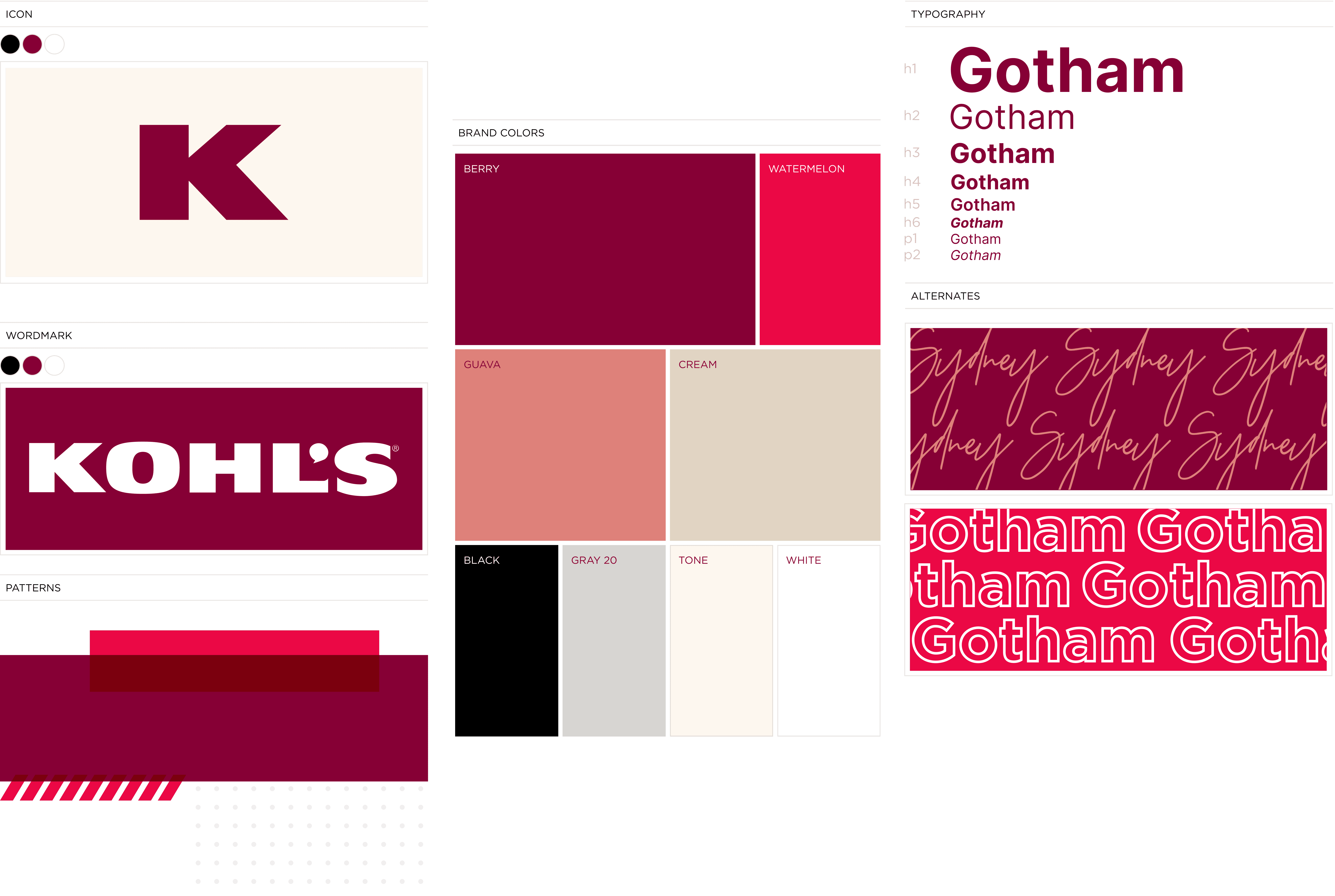
DESIGN SYSTEM
The backbone of the new Product Guide redesign was based on the Kohl's Design System. KDS was ported over for the website; built specifically to ensure high performance.
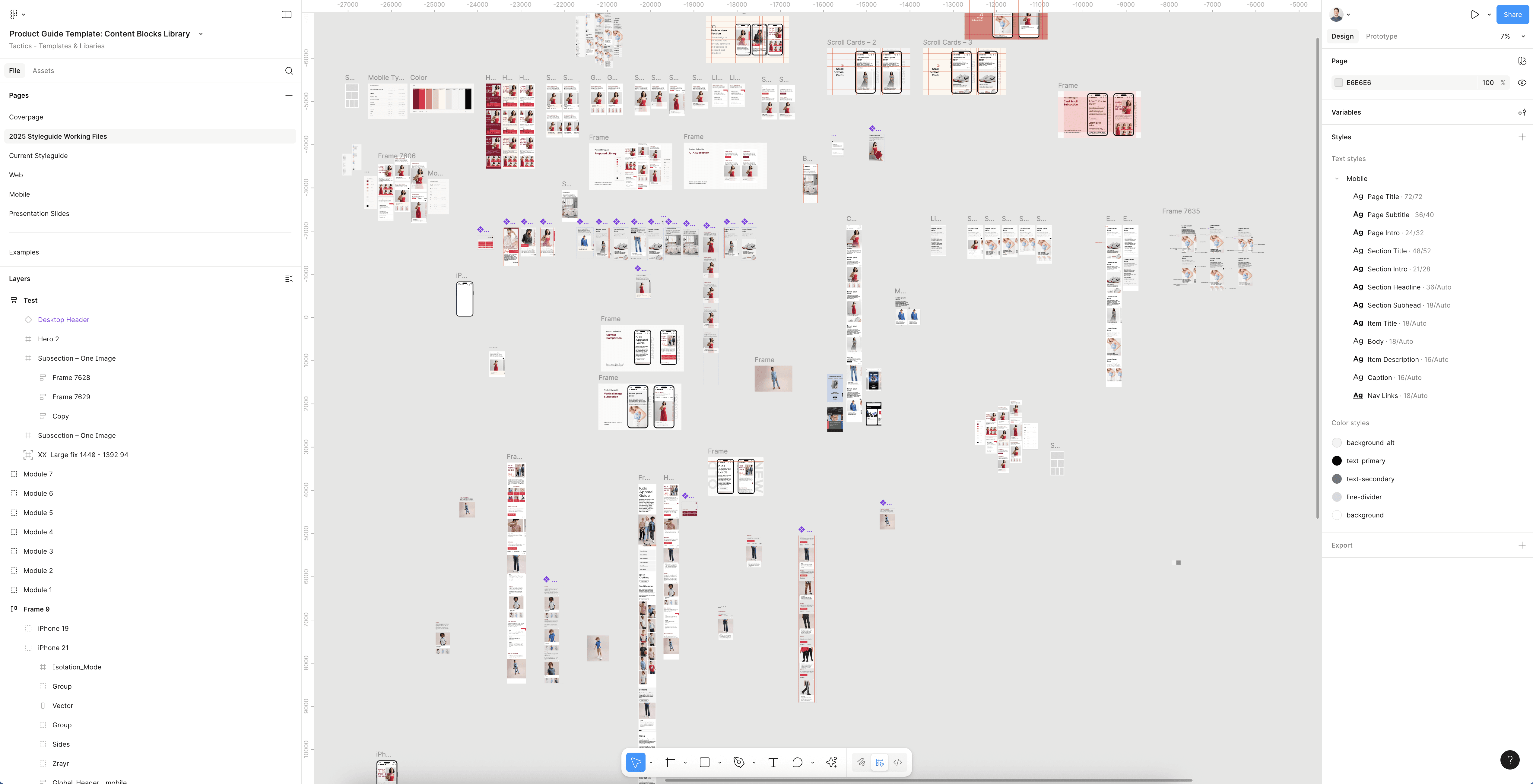
DESIGN ITERATION
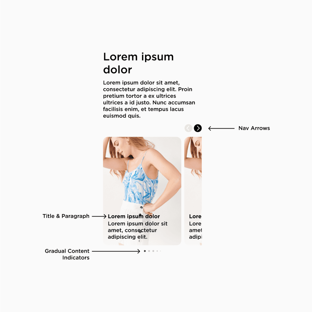
The new Product Guide components went through several design iterations, driven by user feedback and cross-functional input to refine layout, content, and usability. This work led to a polished, shippable solution aligned with Kohl’s design system.


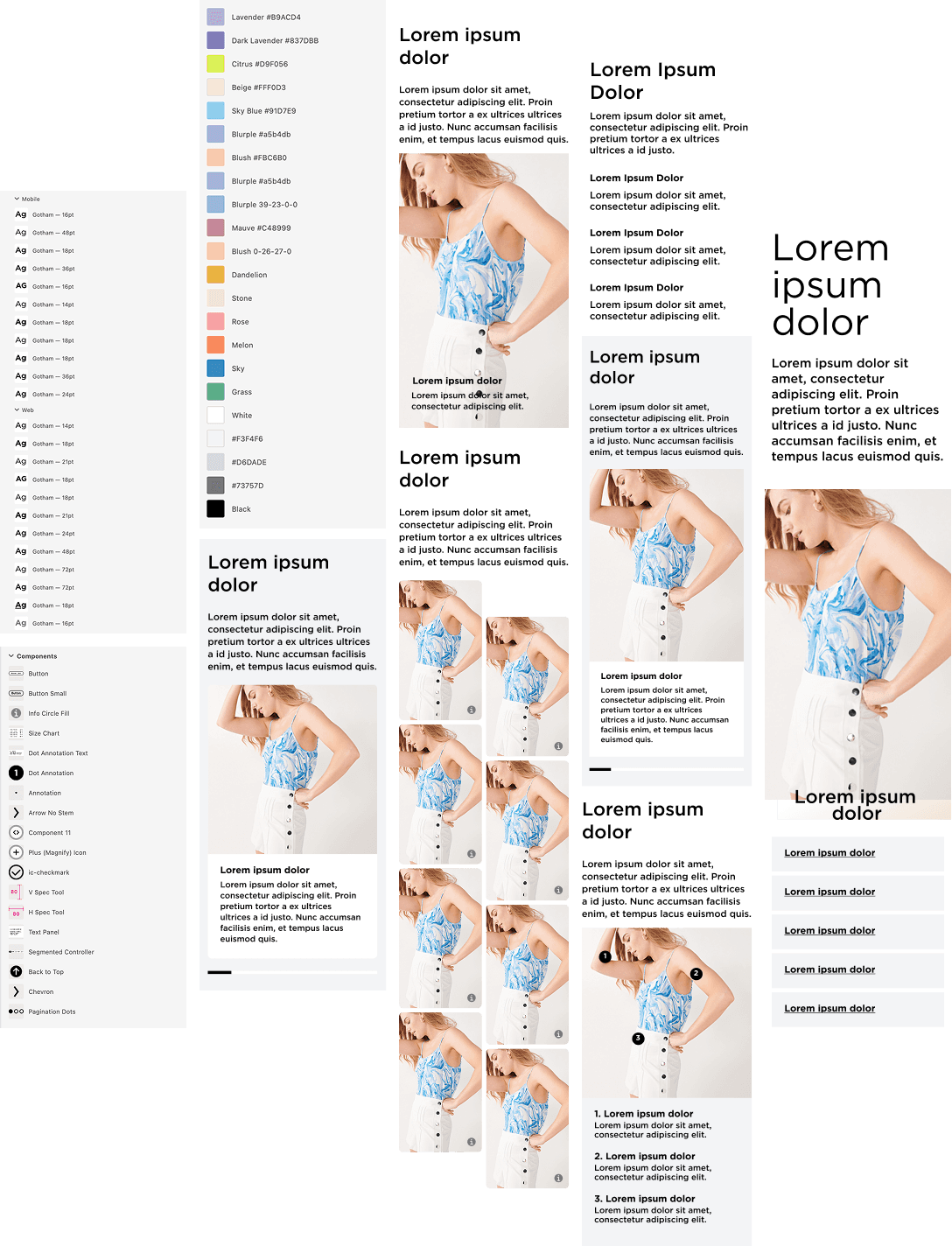
FINAL DESIGNS
After a lengthy approval process, these are our shipped designs.
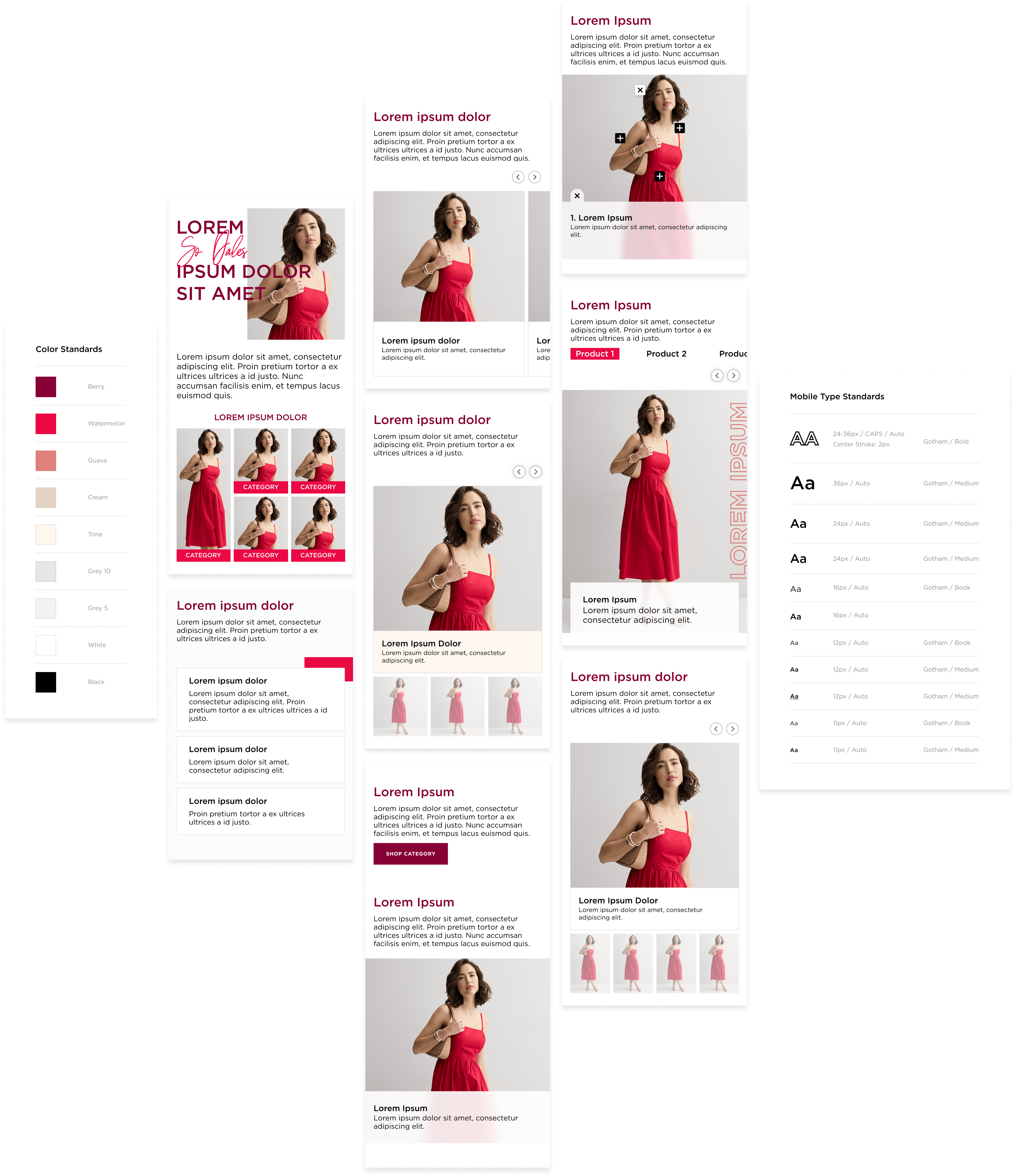
MOBILE & DESKTOP
Presenting responsive design mockups for both desktop and mobile to showcase a seamless cross-device experience.

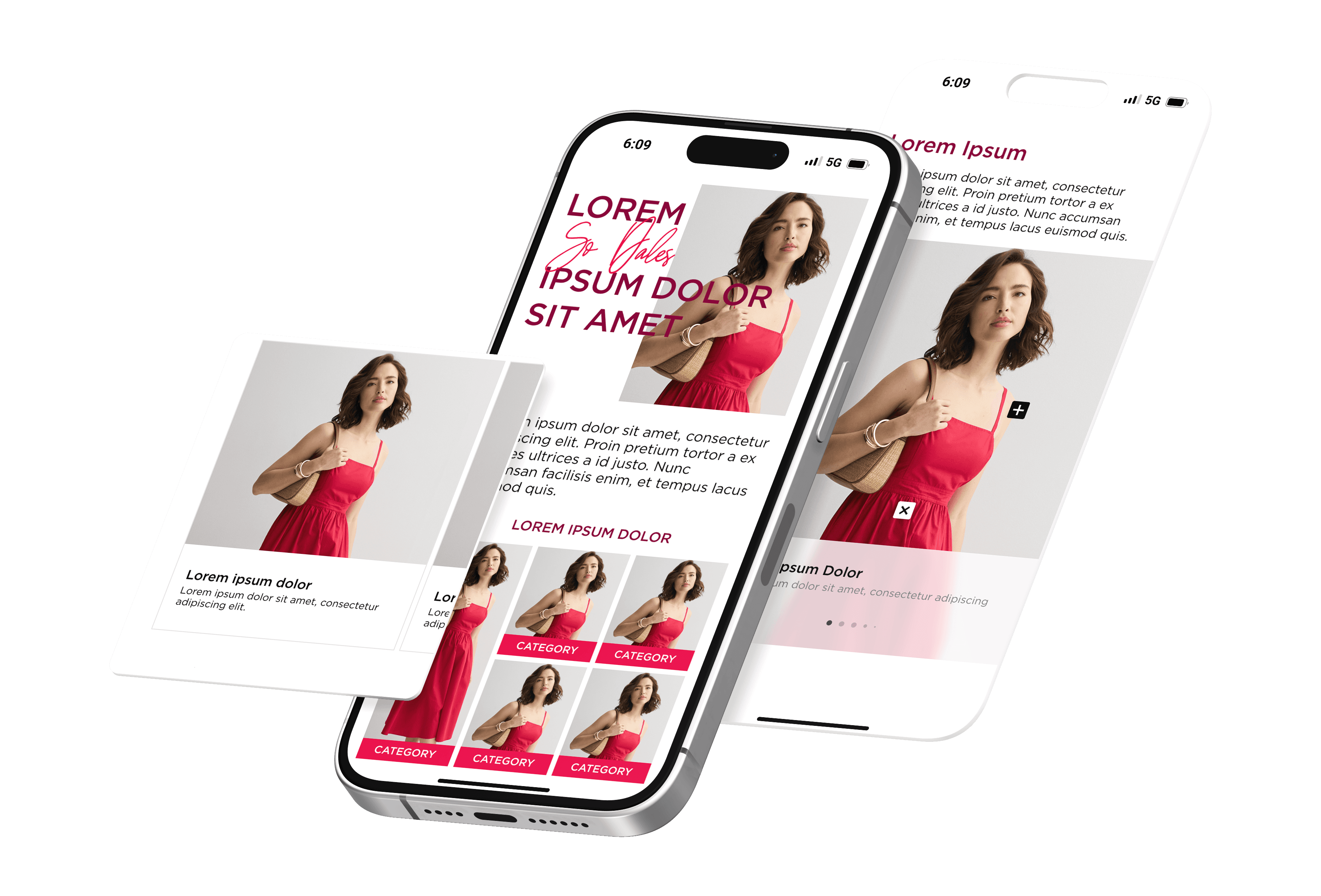


PROTOTYPE
CONCLUSION
The redesigned product guide features an improved look and feel, leveraging Kohl's Design System while significantly reducing unnecessary space. This enhances user engagement and allows customers to view more content, contributing to lower bounce rates.
New Layout
Old Layout
Developer Reviews

"Thanks for all your work on this project. The asset organization is amazing, which is deeply appreciated on such a large project! The overall design looks awesome too, time to start building."

“Thanks again for all your help on this seriously! Big projects like this are easier when the designer and dev are on the same page and have an open line of communication.”

“I appreciate all your hard work in putting this beast together.”
Website curated with coffee in hand. ☕
All Rights Reserved© — Blake Brewer | 2024