I had the honor of leading the initiative to define Kohl's illustration style. Throughout this process, I conducted comprehensive research and successfully secured approval from significant stakeholders within the company. This style has been incorporated into various aspects of the Kohl's brand, spanning website landing pages, transactional emails, and in-store marketing materials.
Product Designer
Illustrations
Categories
COMPETITIVE ANALYSIS
To establish a distinctive illustration style, I conducted a thorough analysis of notable brands’ visual strategies. This research highlighted gaps and opportunities, informing our approach to differentiate Kohl's in the retail space.


INTERATIONS
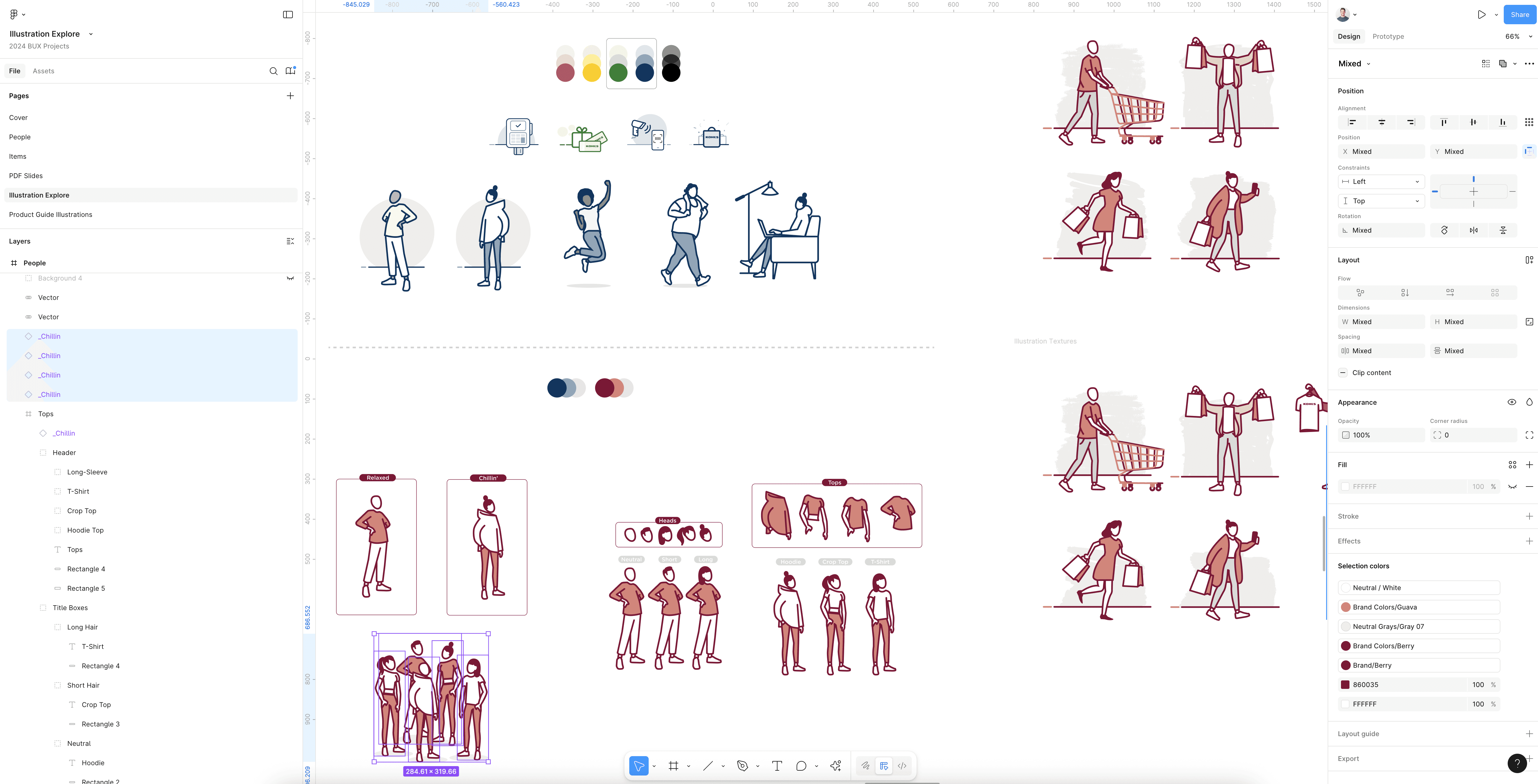
The Kohl's Illustration's went through extensive design iteration to align with brand goals and represent a diverse customer base. From early sketches to final artwork, I explored a wide range of concepts, adjusting color palettes, illustration styles, facial features, and skin tones. Each round of feedback helped refine the visual direction, ensuring the illustrations felt approachable, inclusive, and on brand. This process required close collaboration with stakeholders and careful attention to detail to create a system that resonated across platforms and audiences.
DESIGN SYSTEM
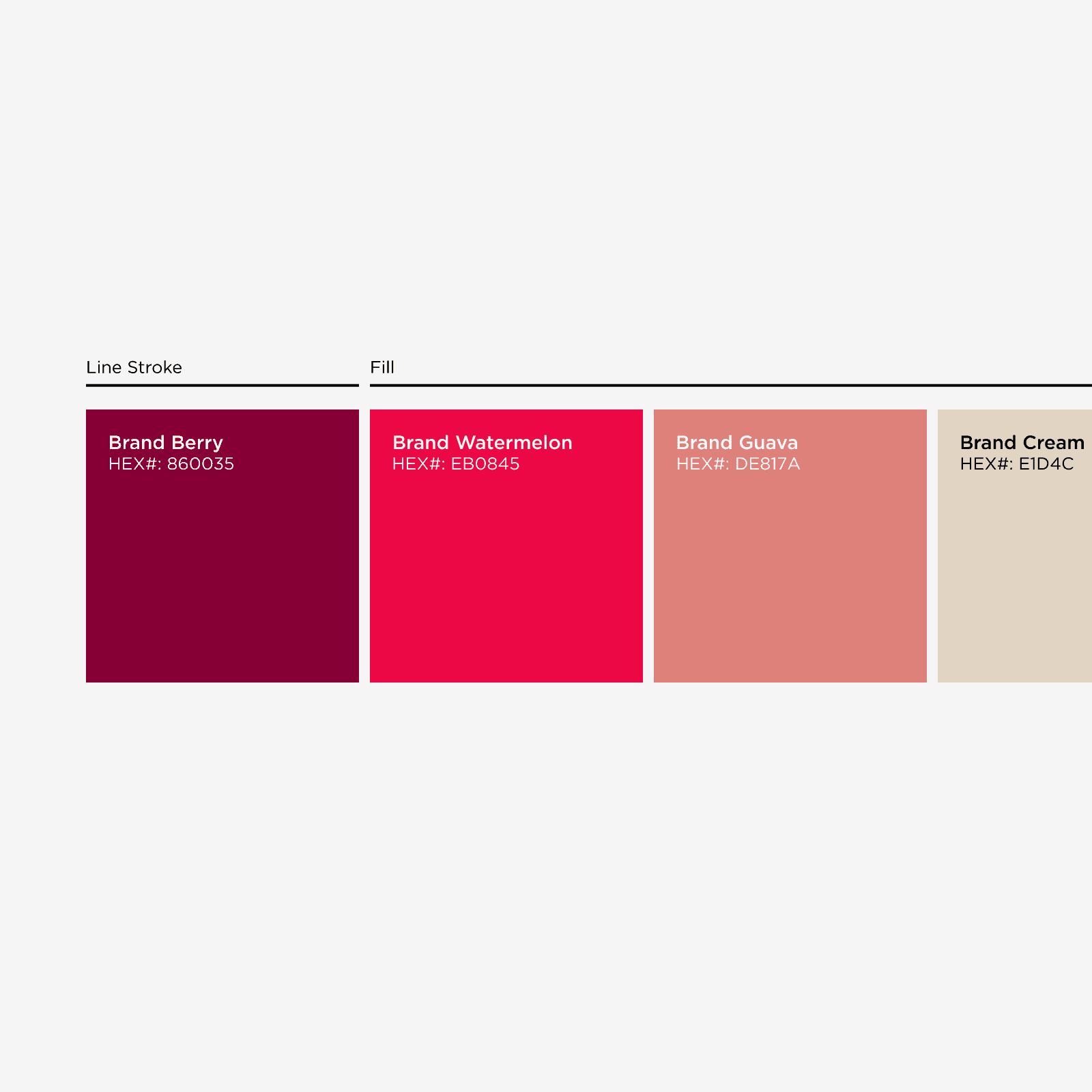
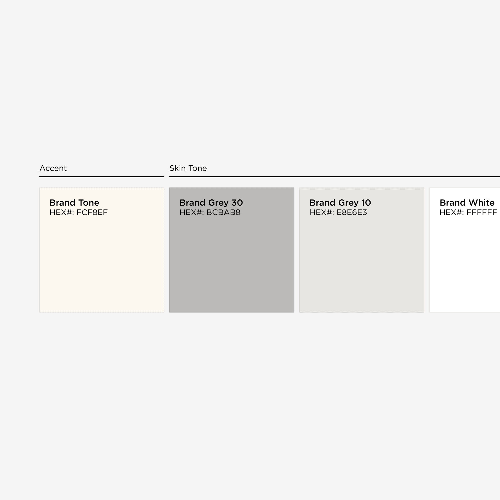
I developed a comprehensive design system, selecting a color palette that adhered to Kohl’s brand standards. The use of grayscale was intentional, aligning with Diversity, Equity, and Inclusion (DEI) principles. This choice not only enhanced accessibility but also allowed for versatile application across various platforms.
Primary Colors
Secondary Colors
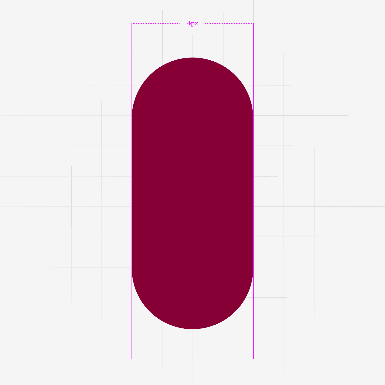
Primary Stroke Weight
Secondary Stroke Weight

DESIGNING DEI
One of the key decisions was to omit facial features from the illustrations. This approach fosters inclusivity, ensuring that the visuals resonate with a wide audience and allow for individual interpretation.


IN-STORE
At Kohl's, I designed and illustrated updated self-checkout screens to improve communication and clarity across the user flow. By pairing custom, brand-aligned visuals with thoughtful UX, the experience became more intuitive, engaging, and easier to navigate; reducing friction and enhancing the in-store journey.


CONSISTENCY
To facilitate a smooth transition to the new illustration style, I led training sessions for team members on how to effectively utilize the design system. These sessions empowered marketing and design teams to consistently apply the illustrations across all channels.
LIBRARY
I created a range of illustrations to align with Kohl’s brand and connect with a diverse audience. Character illustrations focused on relatable, expressive people, while scenic and action-oriented pieces evoked warmth, energy, and everyday joy. Each illustration was crafted to reflect Kohl’s welcoming, family-focused values.


CONCLUSION
The development of Kohl’s illustration style was a collaborative and iterative process that prioritized inclusivity and brand values. I’m proud to have played a pivotal role in creating a visual identity that not only enhances customer engagement but also embodies the essence of the Kohl's brand.
Website curated with coffee in hand. ☕
All Rights Reserved© — Blake Brewer | 2025